
How to Build a $10K Motion Website with Claude
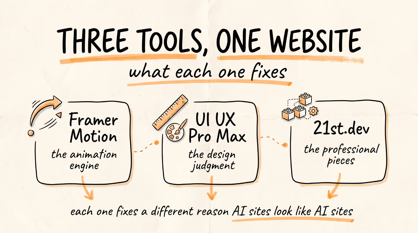
This is the full guide from the video. Three tools turn Claude Code into something that produces agency-level animated websites: an animation engine, a design intelligence skill, and a library of professional components.
Don't want to figure this out alone? I walk members through every step inside the community. Join the Skool → skool.com/raycfu
What You Are Installing and Why
Claude Code on its own writes working code that looks like a developer designed it. Which it did.
Framer Motion gives it an animation engine, so scroll effects, page transitions, and interactions are real animations rather than CSS guesses.
The UI UX Pro Max skill gives it design judgment. It is a genuine corpus, not a vibe: 119 UX guidelines, 192 product types, 74 typography pairings, 105 icon sets, 25 chart types, 17 motion presets, and 22 stack-specific files. That is what enforces real visual hierarchy, spacing, and contrast instead of the default AI-website look.
The 21st.dev Magic MCP generates the actual React and Tailwind components on demand, so you are assembling professional pieces rather than having Claude invent every button from scratch.
Each one fixes a different failure. Together they cover the whole gap between "it works" and "it looks expensive."
The Fast Path
If you want the whole stack in one install, someone packaged exactly this combination:
github.com/tenfoldmarc/website-builder-setup
One install, all three tools, configured together. If that works for you, use it and skip to step 4, which is the part that actually matters. If you would rather install the pieces yourself so you understand what each one does, keep reading.
Step 1: Framer Motion
In your project directory:
npm install framer-motion
That is it. Claude Code now has a full animation library available, and it will use it rather than hand-rolling transitions.
Step 2: The UI UX Pro Max Skill
Easiest route is to let Claude install it. Open Claude Code and say:
Install the UI UX Pro Max skill for me from its official repo, put it in my skills directory, and tell me anything you need from me.
Once it is in, this is the skill that generates your design system: palette, typography, spacing scale, motion tier. It has flags worth knowing, including one that sets motion intensity and one that sets visual density, which is why a dashboard and a marketing page come out of the same tool with completely different numbers.
One honest technical note about the motion presets. All 17 ship with a reduced-motion branch, which is good and means your animations respect accessibility settings by default. But only about 6 of the 17 include teardown, meaning cleaning up the animation when the component unmounts. On a long single-page site that is invisible. On an app with routing, uncleaned animations leak memory. So when Claude adds a motion preset to a component, ask it directly: does this animation clean itself up on unmount, and if not, add that.
Step 3: 21st.dev Magic MCP
Get a free API key from 21st.dev/magic-chat, then register the MCP:
claude mcp add magic -s user -- npx -y @21st-dev/magic@latest API_KEY=your-key-here
Verify it connected:
claude mcp list
You should see magic in the list. Now Claude can generate real components on demand rather than writing every card, nav, and hero from scratch.
Step 4: Lock the Design System Before You Build Anything
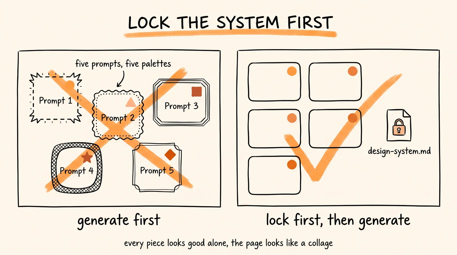
This is the step that separates the sites that look like $10,000 from the ones that look like an AI made them, and almost nobody does it.
Here is the failure mode. The component generator will happily produce beautiful components that do not match each other. Five prompts, five palettes, five font stacks, zero coherence. Every piece looks good alone and the page looks like a collage. Meanwhile the design skill produces a rigorous system that nobody applies, because you moved straight to generating components.
So you lock the system first, in one pass, and then every component gets generated against it.
Before we build anything, use the UI UX Pro Max skill to generate a complete design system for this project and save it to a file I can point you back to.
The project: [WHAT IT IS, WHO IT IS FOR, WHAT ONE ACTION MATTERS MOST]
The feeling: [three adjectives, and one site whose aesthetic I admire]
Lock all of it: the color palette with hex values and where each one is used, the type scale with the actual font pairing, the spacing scale, the border radius, the shadow scale, and the motion tier including how fast things move and how much they move.
Then write it to design-system.md.
From now on, every single component you generate must use these exact values. If something in the system does not work for a specific component, tell me and we change the system, we do not make an exception.
That last paragraph is the whole thing. A design system nobody enforces is a document. A design system every component is checked against is what makes a site feel designed.
Step 5: Build the Page
Now generate, section by section, with the system injected every time.
Read design-system.md first, then build the [SECTION NAME] section for this site.
Use the 21st.dev Magic MCP to generate the components, and pass the design system values into every generation so the output matches everything else on the page.
What this section needs to do: [THE JOB OF THIS SECTION]
Content: [THE ACTUAL COPY, or a placeholder marked clearly]
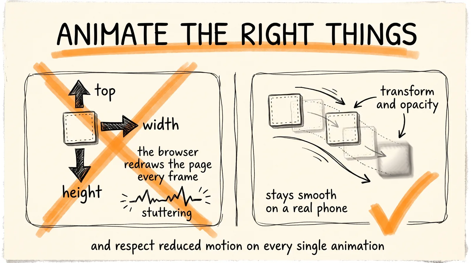
Animation rules: animate only transform and opacity, never layout properties like width, height, or top. Respect prefers-reduced-motion on every animation. Keep entrance animations under 600ms. Scroll-triggered animations should complete well before the element leaves the viewport, and nothing should animate twice on the same scroll pass.
Give me the component code plus anything I need to add to my config.
Those animation rules are not decoration. Animating transform and opacity keeps things on the GPU and smooth, animating layout properties causes the browser to recalculate the page every frame and is why so many AI-built sites feel janky on a real phone. And the reduced-motion line is both an accessibility requirement and something people notice.
Build section by section, checking each one against the previous, rather than asking for the whole page in one go. One long generation is where coherence goes to die.
Before You Call It Done
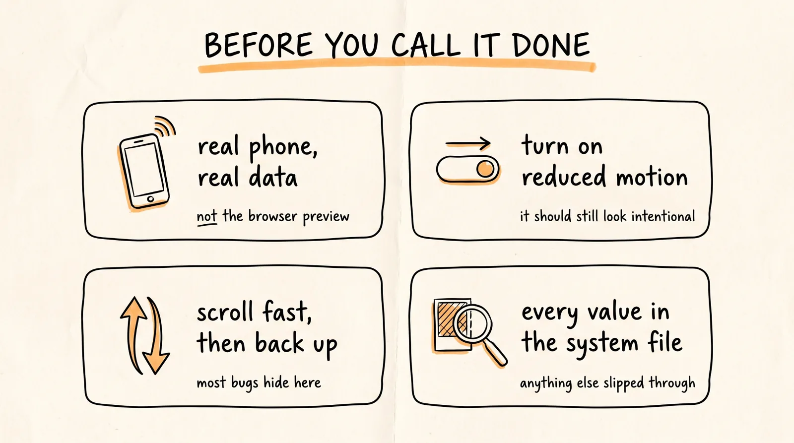
Load it on a real phone on real cellular data, not your browser's device preview. Motion-heavy sites are where the gap between a laptop and a mid-range phone is widest.
Turn on reduced motion in your OS settings and reload. The site should still work and still look intentional, just calmer. If it breaks or if elements never appear, some animation is missing its fallback.
Scroll fast, then scroll back up. Animations that only work on a slow, polite first pass are the most common bug in this style of site.
Check that every color, font size, and radius on the finished page appears in design-system.md. Anything that does not is a component that slipped the system, and that is the thing that makes a page feel slightly off without anyone being able to say why.
How to Sell It
Same play as any productized build. Make three demo sites before you talk to anyone, host them live so they are links rather than descriptions, and send a prospect a version of their own page rather than a pitch.
Price by scope: a single animated landing page in the low four figures, a full multi-page site with a design system in the mid four figures to five, and note that the second project takes a fraction of the time because your design-system.md workflow and component patterns carry over. That reuse is the actual business.
And be straightforward about what you are delivering. You are selling a professionally designed, properly animated, fast, accessible website built quickly. That is genuinely valuable and worth what you charge. It does not need to be dressed up as anything else.
The Recap
Install Framer Motion with npm, add the UI UX Pro Max skill, and register the 21st.dev Magic MCP with your API key. Or use the website-builder-setup repo to get all three at once.
Then the part that matters: generate and lock your design system to a file before you build a single component, and pass it into every generation. Build section by section. Animate only transform and opacity, respect reduced motion, and test on a real phone.
The tools make it possible. The locked design system is what makes it look like it cost $10,000.
Don't want to figure this out alone? I walk members through every step inside the community. Join the Skool → skool.com/raycfu